Email is the most powerful marketing channel for e-commerce, but you need to leverage it properly. While thinking deeply, we come to know, a customer’s inbox is nothing but a distraction-free zone to which you’ve been invited, giving you more chances to grab attention with perfectly targeted offers in comparison to any other digital medium available. Here I’ll show you an ultimate element of an eCommerce email for maximum conversation.
Many online business owners still aren’t aware that eCommerce websites need to be updated regularly to maximize profits. Some business owners would admit that their current revenue is adequate and enough, and updates aren’t warranted. Maybe you consider it isn’t worth the effort or time. But what in case even just one simple improvement brings an amazing incline in the monthly sales?
Maybe even exponentially. What do you say now? Is it worth it then?
You need in-depth research, sometimes believe in trial and error, and a great understanding of your audience. Most importantly, you need to implement a whole and well-planned series of best practices to develop a strategic approach, and then, you’ll be more likely to achieve your core objectives. Here we display 5 email marketing elements worth respecting to help you ensure sure you’re getting the results you desire:
SPECIAL NOTE:
No matter if you follow our recommended tips or whichever tips, still your Email marketing campaign may not kiss successful, and that’s because most of the newbie and mid-level email markets still make a big mistake by now using an Email Verification Service. If perfection is your goal, then do consider spending a few bucks in buying the ultimate service from MyEmailVerifer (the most accurate email verifier out there). Without it, your campaign is at risk.
5 Ultimate Elements of eCommerce email for max Conversion
1. Timing and Frequency
Now, both these words are truly heavy and worth respecting when it’s all about email marketing. The timing in which you shoot your campaigns is among the ultra-crucial elements to focus on in every single email marketing strategy.
For instance, you may be located in Chicago, but perhaps a huge portion of your target audience belongs to a different time zone. The point of time in the 24 hours cycle in which users receive emails directly contributes to performance indicators such as click-through rate. Segment your contact lists, keeping your recipients’ time zone in mind so that they receive your emails at an hour that’s appropriate and convenient for them.
Sending the same message at the same minute or hour to a global audience and expecting to reach everyone is truly a no-brainer.
If you’re planning to maximize user engagement by sending emails but aren’t sure about the sending time, a good spot to begin is by considering three main times slots-during the morning when your email receivers are commuting or going to work, during the early afternoon hour on their lunch break, and in the pleasant evening hour when they are home.
Also, keep the audience’s lifestyle habits in mind. If you’ve launched campaigns a few days or months back, take a gander at the crucial statistics offered by your email platform and notice when the chances of readers giving some attention to your email are the highest.
What’s important besides right timing?
Besides your email’s timing, the frequency at which you distribute your messages also plays a considerable role in performance. Gone are the days of email blasting. Users have great email fatigue nowadays and won’t even prefer opening your message if they are overwhelmed with a plethora of emails.
If you send more and more messages, it’s going to be less and less effective. Putting more effort and getting fewer results is a thing nobody likes.
Your emails may have a short “rack life,” but this doesn’t mean you need to send a new one every day. That’s how you’ll get a great surge in unsubscribers. Rather, keep your email shooting speed at two per week at maximum to ensure that you still reach users and cut through the clutter of your customer’s inbox. Depending on the industry, sending an email twice per month proves to be even more fitting.
2. Subject Lines

The significance of a tremendous subject line cannot be explained enough-it’s truly the first thing users pay attention to and their first “personal” impact on your brand.
An impactful subject line sparks interest in the blink of a wink and builds anticipation of your email’s content. That’s enough for you to get the user intrigued while still staying honest to your brand in below 50 characters. It’s okay to stress a little outside the box and include some creativity in your subject lines to spice things up, but don’t forget that simplicity usually works best.
The best subject lines prove to be a happy medium between flowing creativity and being straightforward toward the point of your reason behind emailing a user while considering the brand image in mind. The target of a subject line is to allure recipients to open your message and to tap through your email.
For that cause, it’s crucial to stay consistent as you move from the subject line to the main content. You should never use a “clickbait” title just so that the receiver opens the message just to disappoint them upon finding absolutely no relevance to what they initially found in their inbox.
This imprints a poor sense of trust related to your brand and almost guarantees that your users won’t take the desired action. They may opt-out of receiving your emails as well. In case there’s some idea for a subject line, but you’re unsure whether it’s relevant to your brand, never hesitate in asking your colleagues for feedback.
Sometimes, an outsider’s viewpoint can shed some highly needed light on your ideas. Besides that, segmenting your email lists into two groups and performing proper A/B testing on different subject lines offers you hard data regarding which line resonates the best with users.
3. Content: Visuals and Copy
When it comes to conveying the message, images speak louder than words. These words prove to be absolutely true with any successful email marketing strategy.
Generally, the “more visuals than copy” formula works brilliantly in an email, but it’s still beneficial to put effort into the writing. Explaining it further, users don’t prefer getting too much to read.
They just want to be able to remove the content and get an understanding of the core messaging. If you put a lot of content and offer it to your audience, don’t include all of that in the email. You can use a call to action (CTA) button and direct users to a dedicated landing page on your site where those who desire can read the full article.
Every email campaign comprises a specific call to action; no matter it’s to visit a website, purchase something, or enter an email, the reader is always demanded to react in some way. The more you ask from the user, the more enthralling your content needs to be.
A bit more about CTA and reader’s convenience
The CTA should stand out from the message making the reader easily notice it and tap on it without anything obstructing their actions. Ensure these buttons are vibrant, attractive, and prominent in contrast to the rest of your message while still comfortably fitting with your design theme.
Images are crucial to the success of any email marketing campaign, and you want to ensure they’re loading quickly and appropriately for users. You should use a file optimizing tool and ensure images load efficiently, as if users are waiting too much for the image loading, they’ll likely skip it or even delete your message altogether.
Sometimes a browser or an ESP may not display the images properly within an email. You can include relevant image alt tags to let users have at least some context regarding what the visuals are all about if they don’t appear right away.
This minute effort can roll on a long way with offering a good user experience. Recently, many companies are experimenting by including GIFs in their email campaigns. In certain times, this can be a daunting feat. Not all email platforms will support their loading correctly, or they will just load one frame of your GIF instead of offering users the full effects of your animation.
If you’re planning to utilize these sorts of visuals in your emails, properly test it on numerous platforms, and in case it freezes on a given frame, ensures it’s an image that can still give users a thorough understanding of what your content is all about.
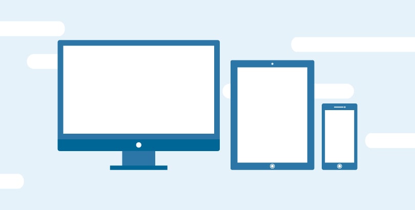
4. Optimization for All Devices

Once upon a time, all users used to access their inbox on their desktops, all from the same email platform. But those days are gone! Today users are connected to email via tablets, desktops, smartphones, which include a great range of numerous devices.
The way one of your viewers views an email isn’t actually the same way your other one would, so to ensure that the accessibility of your emails isn’t jeopardized for any users– you need to design a responsive design email, which is typically the best solution.
If you want your readers to view your content as intended, a user-friendly experience is a must. And for that, you certainly need to optimize an email design to perfectly fit nearly every device and platform imaginable.
But wait…
If you aren’t in favor of using a responsive design, just investigate which are the most used devices among your audience and tailor your email to those functionalities. Just a common tip here – most of your visitors will be android users, but still, it depends on your niche.
This rapidly growing audience is continually on the go and expects the companies they engage with to understand that. You need to optimize Clickable items on a mobile device for touchscreens, using a thumb, and not a mouse. Strictly ensure that you don’t leave any extra work for the user to do (zooming in or zooming out or any other such functionality) to view the images in your message.
No matter your core focus, maybe on a certain group of users, you should be optimizing all your email campaigns for the entire audience, meaning that they feel equally convenient with your content, your way of presentation, and everything.
Litmus is an awesome tool that permits you to cherish how your email is going to render on various devices and platforms before sending it. You certainly need to give it a look before launching any email campaign.
5. Personalization
Whatever content you send users via email initiatives should be relevant and, on top of that, offer significant value because if it doesn’t then, it’s of no use.
Marketing to any user as an individual, putting some spice of personalization no longer requires an example, and it should start with addressing them with their first and last name.
Pretty much like the conversion funnel, an email funnel permits you to target users with more certain content as they show the signal of progressive interest and they actually come closer to becoming your customer.
If any user in your email list signed up for your newsletter on any certain blog post, you could segment them as per the relevance of the content that they show interest in.
Your messages will be more effective By personalizing your emails in a stepwise process based on relevance since the content couples to what initially made them interact with your brand. What about considering an example?
Suppose you’ve got a newsletter sign-up on your email marketing blog. After reading an article regarding email marketing, the user agrees to offer you their contact information. Not, it’s the time to think that if you send them a follow-up email addressing logo design won’t anyway fulfill their needs since it’s strictly against the reason for which that user signed up.
Rather, set up a well-planned funnel for users within that group, and send them a whitepaper that provides further detail regarding the subject, so that reader has a higher chance of opening your email and moving further forth in the funnel which will lead them to buy a service/product from your company.
James P. is Digital Marketing Executive at MyEmailVerifier. He is an expert in Content Writing, Inbound marketing, and lead generation. James’s passion for learning about people led her to a career in marketing and social media, with an emphasis on his content creation.
